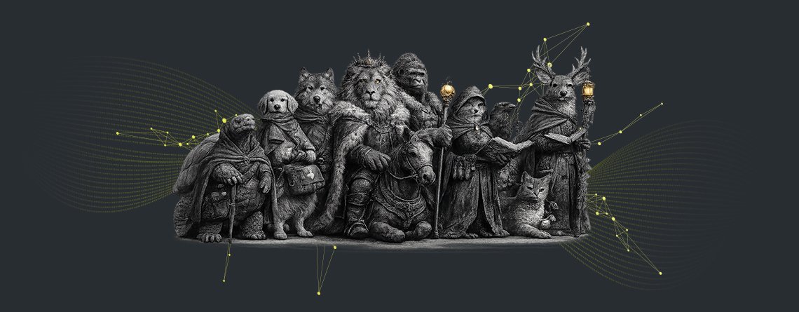
Table of Contents
IDENTIFYING THE MARKETING DESIGNER
From visual executor to strategic architect
Identifying the Marketing Designer as only a visual executor is an outdated perception that limits the true value of the role. When a Marketing Designer is seen simply as someone who “makes things look good”, the focus rests narrowly on aesthetics and surface level polish. This undermines the potential of graphic design projects, because it separates design from the deeper questions of who the brand is, how it behaves, and what it wishes to evoke. The result is fragmentation between strategy and expression, where brand thinking sits in one place and visual execution sits in another, weakening coherence across campaigns and touchpoints.
When the Marketing Designer is reconceived as a strategic partner, the relationship between design and meaning changes completely. Instead of decorating pre decided messages, the Marketing Designer becomes involved in shaping those messages through behavioural psychology, Jungian Archetypes, and systems thinking. Behavioural psychology helps the designer understand how people perceive, process, and respond to information, which informs layout, hierarchy, and interaction in a more intentional way. Jungian Archetypes provide a rich language for brand personality and emotional resonance, guiding choices about imagery, tone, and symbolism so that the brand feels consistent and recognisable at an instinctive level.
From this perspective, the Marketing Designer evolves into a strategic architect who helps build comprehensive brand guides that do more than specify colours and logos. These guides shape voice, behaviour, and emotional resonance across all touchpoints, ensuring that every piece of communication feels like part of a living, integrated system. Systems thinking allows the designer to see how small decisions in one asset affect the wider experience, from social posts and websites to packaging and environments. By redefining the Marketing Designer in this way, organisations gain a strategist who connects strategy and expression, aligning what the brand says with how it looks and feels in the world.
THE MARKETING DESIGNER DISCONNECT
Breaking down the gaps in modern brand development
The persistent habit of seeing designers as mere visual executors rather than as contributors to brand development is an underestimation of the value of a Marketing Designer. When this happens, misalignment between brand strategy and creative output becomes almost inevitable. Strategy is written in one room, creative decisions are made in another, and the bridge between the two is weak or improvised. Inconsistent application of brand guidelines follows, because those guidelines often focus on static elements such as logos and colour palettes, without fully expressing the thinking behind them. Without a shared understanding of intent, different teams interpret the same rules in different ways, and the brand identity slowly drifts.
A deeper layer of the Marketing Designer Disconnect appears in the absence of psychological depth in brand positioning. When projects neglect research, cultural insight, storytelling frameworks, and digital experience design, the result is a brand identity that may look attractive but feels thin. Without research, the brand risks speaking into the void rather than into a specific context. Without cultural insight, it may overlook symbols, references, and narratives that would make it truly resonant. Without storytelling frameworks, communication becomes a series of disconnected messages rather than an unfolding narrative. Without thoughtful digital experience design, even strong ideas can feel disjointed across websites, apps, and social platforms. All of this contributes to diluted brand identity, where the brand is present but not particularly memorable or meaningful.
Archetype led branding can be a powerful way to bring psychological depth into brand positioning, but only if it is integrated into broader strategic thinking. When archetype led branding is treated as a one off exercise or a set of labels attached to a style guide, it becomes superficial rather than transformative. Choosing an archetype such as Hero, Sage, or Caregiver is not enough on its own. The real value comes when those archetypal patterns inform research questions, cultural insight, storytelling frameworks, and digital experience design. In this integrated approach, the Marketing Designer becomes a vital partner in translating archetypal intent into consistent experiences across all touchpoints, closing the Marketing Designer Disconnect and helping the brand express a coherent, psychologically rich identity in the world.
MARKETING DESIGNER EXPECTATIONS
The strategic friction that hinders growth
Marketers and brand managers may carry pain points around tight deadlines, shifting priorities, and the pressure to deliver visible outputs quickly. Marketing Designers, in turn, can feel reduced to execution, asked to “make it look good” without being included in upstream conversations where strategy is defined. Misunderstandings around the scope of the role then emerge. Some stakeholders assume the Marketing Designer is responsible only for layout and aesthetics, while others quietly expect them to interpret brand strategy, solve user experience challenges, and bring behavioural psychology into play, all within the same compressed timelines.
Time pressures frequently favour execution over exploration, which deepens this strategic friction. When every brief is urgent, there is little room for research, iteration, or testing new storytelling frameworks. The question of how behavioural psychology translates into commercial value adds further uncertainty. Marketers and brand managers may be interested in ideas such as cognitive bias, motivation, and memory, but feel unsure how these concepts should practically influence design decisions and measurable outcomes. Marketing Designers may understand how to apply these principles visually and structurally, yet lack a shared language with stakeholders to explain the commercial impact, such as improved engagement, higher recall, or better conversion.
Despite these challenges, stakeholders are remarkably aligned in what they truly want from the solution. They want cohesive brand stewardship that ensures every touchpoint feels part of one recognisable whole. They seek consistent expression across platforms, from digital to print to environment, so that the brand does not feel fragmented as it moves through different contexts. They look for measurable emotional engagement, where design helps build affinity, trust, and advocacy, not only awareness. Most importantly, they want a collaborative framework that turns insight into practical implementation, where Marketing Designer expectations are clearly defined and respected, and where designers are empowered to use behavioural psychology and strategic thinking to support growth. When this happens, strategic friction gives way to shared momentum, and the Marketing Designer becomes a key partner in shaping brand performance.
MARKETING DESIGNERS AND JUNG
Leveraging behavioural psychology and colour theory
Marketing Designers shape perception and influence behaviour through archetype led branding that is both intuitive and strategic. Each archetype carries a deep psychological pattern that audiences recognise at a subconscious level, while its associated colour amplifies the emotional signal at a glance. Each of the 12 Jungian Archetypes can be divided into the following four categories.
1. Order

Meaningful because it turns chaos into safety and uncertainty into stability. People driven by Order create the structures that let others thrive: rules that protect, routines that reduce anxiety, standards that improve quality, and systems that make life predictable enough to build on. Society needs these people because not everyone can innovate or explore when the ground feels unstable. Here are the Colour/Archetype combinations for order-focused brands who carve out belonging by becoming the steady hands who create environments where trust, responsibility, and long-term progress can take root.
TURQUOISE/CAREGIVER
Just like this persona this colour is often overlooked. TURQUOISE is a tertiary colour, a primary and a secondary colour have to exist first for Turquoise to be included in the colour wheel. Just like it’s complimentary archetype CAREGIVER, its role is support and service – never in the spotlight, but always nearby to protect any and all who may fall in harm’s way. Many brands shy away from the greater good as their mission, as it’s a might undertaking, but if your brand message is one of gratitude and care, take the road less travelled.
Example: Pampers
GOLD/RULER
This is not the technical name of this colour on the colour wheel but, again, it’s sometimes about your get reaction to a colour, and if the combination of yellow and orange is rich enough it can look like GOLD which is a fascinating colour for a brand to adopt as its own. Gold means refined luxury so it can only belong to the RULER. A brand persona who wants to communicate to their audience that they are elite, wealthy and successful.
Example: Versace
PURPLE/CREATOR
One can almost feel innovation, imagination and originality when you look at the colour PURPLE. It’s a colour that’s full of potential – complex and rich, yet at the same time encourages a starting with a blank slate to build something exceptional from the ground up. The CREATOR archetype embodies these traits perfectly. This Brand Persona has a vision and aspires to unlock imagination to create that vision. Brands that encourage self-expression and forging the future will find success if they embrace this combination.
Example: Twitch
2. Freedom

Necessary because it keeps society alive, expanding, and honest. People driven by Freedom resist stagnation and push against invisible constraints, like social expectations, outdated beliefs, limiting identities, or inherited “rules” that no longer serve. They explore, question, and learn, making room for new ideas and new ways of living. Society needs them because the future does not arrive by default; it is discovered, tested, and chosen. Here are the Archetype/Colour combinations for freedom-focused brands who belong where curiosity is valued and where the right to grow is protected.
VIOLET/INNOCENT
Diving deeper into the psychology of colour will probably reveal why two such similar colours evoke such different feelings. Where purple is a strong colour, VIOLET is quite passive. Silent and sweet.
The brand persona that might benefit from using this colour is the INNOCENT, a wholesome and humble archetype striving for happiness. Always being honest, fostering a feel-good spirit and keeping it simple is who these brands are.
Example: Hallmark
GREEN/SAGE
Another colour that can have a range of connotations from health and nature to purity and peace is GREEN. In the context of the audience as a customer it can evoke understanding and education, traits aligned with the SAGE archetype. This brand persona is an intelligent expert who guides others on the path to wisdom. Celebrate life-long learning and influence others to find the answers they need by incorporating more green if you’re a Sage or adopting Sage tactics if the colour green is a core component of your brand identity.
Example: TripAdvisor
BROWN/EXPLORER
When you think of the saying “Make It Count” – bolder colours like red or orange might come to mind. But practically a person who embraces freedom would be more earthy, natural, and organic. Living life to the fullest means you get your hands dirty, so BROWN is your colour. Constantly improving on your own limits and exploring the unknown is what the EXPLORER is known for. Brands who adopt this persona are rugged and daring and they relish every adventure.
Example: Timberland
3. Connection

Humans do not flourish in isolation. People driven by Connection create cohesion: they build relationships, foster community, and make others feel seen, included, and emotionally safe. They are the social glue that turns groups into teams, neighbourhoods into networks, and customers into communities. Society needs these people because progress without belonging becomes brittle. These are the Archetype/Colour combinations for connection-focused brands who carve out a place in the world by becoming the bridge builders, listeners, hosts, collaborators, and culture shapers who help people feel they matter.
PINK/LOVER
Sometimes colours can mean contrasting things. Red can mean anger AND passion, but PINK is surely one of the most transparent colours. The feeling you get when you are pink is likely to be the same as most other people. It’s soft and calm and clear. Research has found that it also evokes feelings of relaxation, perfect for the LOVER brand persona. This archetype is soothing and affectionate. If you want people to titillate the senses and make people feel beautiful, your brand is the Lover persona and pink is your colour.
Example: Victoria’s Secret
YELLOW/JESTER
If your brand persona is optimistic, fun loving and playful, choosing YELLOW as one of your core colours is a great choice. This colour is uplifting. It puts a smile on everyone’s face and even thinking about it makes you feel warm and joyful. If you need a mental ray of sunshine or a just-because pick-me-up, simply think of the colour yellow and your shoulders will feel a bit lighter. With the mission of living life to the fullest and promoting good times the JESTER is the perfect persona for this colour.
Example: McDonald’s
GREYSCALE/EVERYMAN
So many brand personas take up space and seem larger than life, but of course, not every potential customer will relate to that. In a world of bright colours some people honestly prefer the comfort of GREY, black or white. These types of people relate to brands who are humble and inclusive. This is the EVERYMAN archetype. This brand persona just wants to belong, they don’t want to stand out, they want to create a community build on contributions from everyone.
Example: Wikipedia
4. Legacy

Essential because it gives society momentum and meaning beyond the present moment. People driven by Legacy are motivated to leave things better than they found them through breakthroughs, leadership, reform, art, or courageous action that changes what is possible for others. They take risks, confront hard realities, and pursue impact that endures. Society needs them because comfort rarely produces transformation. They belong where the stakes are high and the vision is long-term. You can find them building institutions, leading movements, inventing, teaching, or creating work that carries forward when they are no longer in the room. These are the legacy-maker Colour/Archetype combinations.
ORANGE/OUTLAW
Different colours mean different things to different people in different contexts. Orange might make some think of foods of that colour, others think of the seasons or a temperature. Generally, however, we associate a colour with the initial jolt it gives our system. Orange is a bold colour. It immediately stands out in a crowd. So, if your brand is disruptive, rebellious and craves revolution you are an OUTLAW persona, and we encourage you to incorporate some ORANGE into your branding to let people know that you are here to denounce the status quo.
Example: Harley Davidson
BLUE/MAGICIAN
We’re here to explore what the colour and the persona each mean, and the word magician has various connotations. In the context of Brand Personas, we want to forget about trickery and focus on wonder. The MAGICIAN is mystical but not mysterious. They want to make dreams come true. Because the colour BLUE evokes trust, quality and integrity this colour is a great way to let people know your brand wants to take them on a journey of transformation.
Example: Disney
RED/HERO
Research has shown that in retail or purchasing situations RED is associated with immediate action. That’s why SALE signs are usually read. It prompts people do something, now! Which is perfect for HERO brand personas who embody courage and adventure. If your brand is bold and want to communicate to your audience that you here to save them and you are quick and capable at doing it use more red.
Example: Netflix
Based on the Jungian Archetypes, each brand persona has an individual voice and personality. Of course, in real life execution brands that match the same archetype doesn’t always incorporate the same colours in their brand identity, and brands of a certain archetype might even incorporate seemingly counter-intuitive colours into their branding and logo design. Decisions such as these are quite complex and take into consideration many other factors.
THE IMPACT OF A TRUE MARKETING DESIGNER
The strategic partner in action
In real projects, the evolved role of the Marketing Designer shows up in sharper briefs, more coherent campaigns, and brand assets that feel unified across every touchpoint. When designers are involved early as strategic partners, they help translate positioning, behavioural insight, and Jungian Archetypes into concrete visual and verbal systems. This reduces fragmentation between strategy and execution, which means less rework, fewer mixed messages, and more campaigns that land with clarity and emotional resonance in the market.
By reflecting on these tangible benefits, it becomes easier to see that embracing the true Marketing Designer offers a compelling case for marketers and brand managers. This partnership acts as a catalyst for enduring brand success, because it connects insight and imagination in one integrated process. Instead of treating strategy and design as separate worlds, teams work together to shape brands that are both commercially effective and emotionally meaningful. In this way, the impact of a true Marketing Designer is felt not only in how the brand looks, but in how it behaves, how it is remembered, and how it continues to grow in the hearts and minds of its audiences.
Updated: 27 March 2026
